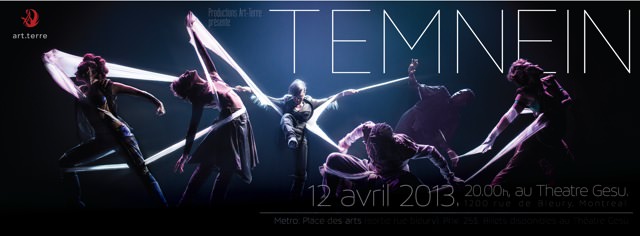
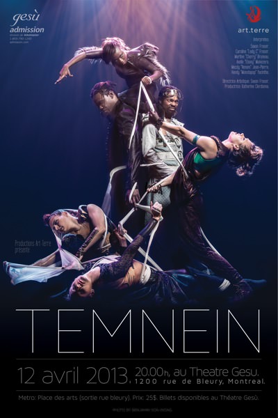
Earlier this year I was asked by dance company Art-Terre if I would be interested in shooting some promo material for one of their upcoming shows: Temnein. Coincidentally, Chance from FullyM.com was in town and wanted to feature me at work. Since I’ve had numerous requests to give a little more insight on how I shoot my dance-related photography, I blended the two events together to bring to you guys this educational video.
Hope you enjoy the results:
Developing the concept
Katherine first contacted me while she was touring in Haiti. She was coming back in a couple weeks and knew that she needed to come up with some promo shots for her upcoming show that was going to happen on the 12th of April. As I had never seen the show, I asked her to send me whatever material she had available – photographs, drafts, sketches, video clips… anything that would help give me an idea of what she was looking for.
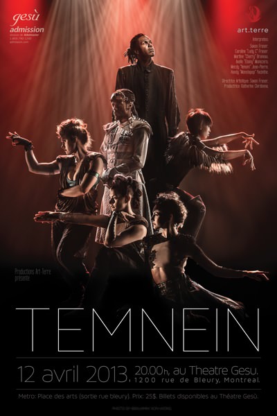
I met up with her art director and choreographer Saxon Fraser to determine what the exact look and feel of the images was meant to be and we settled on creating large elaborate storytelling pieces that would accentuate the interactions between the dancers.
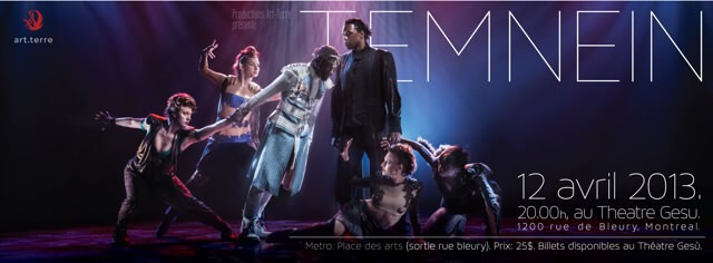
We targeted key moments in the piece that would be iconic and representative of the entire piece and made sure to create images that would fit both a horizontal facebook cover-photo layout as well as a vertical poster-layout.
Since this was to be a dance show, we had to make sure that the lighting in the images would stay faithful to the show so we decided to use the Gesu Theatre with a similar lighting configuration that was going to be used during the show itself.
Lighting the set:
Although the easiest solution would have been to simply use the stage lighting and nothing more to light these shots up, I didn’t want them to look just like event shots. I wanted them to have that 3-dimensional studio-flare that you get from having your subjects perfectly lit.
To achieve that, I brought in my Paul C Buff lighting kit in to play with the dancers and used them to highlight the subjects while I let the stage lights take care of the background atmosphere.
The first step to setting up the “ambient” background light was to familiarize myself with the lighting configurations that were available. For those of you who have never played with stage lights, they can be easily configured and organized by the lighting tech on set. Communication with the lighting tech on the spot is critical to have full control of the effects, colours and textures of light that are available to you. In my case, I had him flick the effects on and off one by one as I looked to the stage trying to imagine the variety of poses that we would be creating. Once the lights are configured, it’s relatively annoying to have to bring the entire grid of lights down, reconfigure and send them back up again so pre-visualization is quite important.
From there on, the studio strobes were brought in to help accentuate the poses of the models. The advantage of studio strobes over the stage lighting is it’s ability to focus in and highlight certain key elements as they’re far easy to move around than their stage lighting equivalents. For example, stage lights are most often located on either the ceiling level or the floor level whereas proper side lighting is a lot more uncommon. And even when it does exist, it is hardly ever a setup that can be properly gridded.
Of course, blending studio strobes to ambient light meant that I had to do a little bit of mental juggling between getting the lowest possible ISO (800), an acceptable depth of field (~f4.5) with a relatively safe shutter speed (~1/30th) and add onto the flash into the mix at the proper settings.
Though it sounds complicated when thrown out there mathematically like this, if you’ve ever tried to blend ambient and strobe light outdoors, there’s not much different – except in this case you’re certain the ambient won’t change on you!
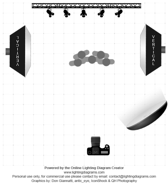
Lighting Diagram designed by Chance from Fullym.com
Transforming concept into reality:
Like most images that you so often see so clearly in your mind, when it comes to actually making it happen in reality there’s always a slight jerk back to reality.
When trying to design complex poses such as the ones that we had going, thing were even harder to calibrate. Not only did we need to come up with intricate poses, it also involved having dancers tied up and climbing over one another!
This is where a nice balance is needed between what you need (rule of thirds, lighting, golden spiral, triangles, emotion, lines and shadows), what’s physically possible (no, she can’t balance on her left leg while wrapping her right around her neck), and what makes sense to the piece.
This is where communication comes in extremely handy and it becomes particularly valuable to share your insights and opinions with the other members of the team (client, art director, dancers) to get the best results. Dancers especially are extremely conscious of their body positioning and can help you come up with the proper pose if you explain the rules of composition that are needed. Sharing your work with the art director as you move along also helps to ensure that your vision of the piece isn’t getting too far away from what the final result they were looking for was going to be.
As I mentioned in the video, don’t forget that the subjects you’re posing on stage are actually human beings so remember to not tire them needlessly. Giving them the cue to relax is very appreciated and will make a difference in your final image. And though I am extremely guilty of saying “One more… ok just one more… annnnd one last one… andddd a final one… annnnd… “ I never leave my models hanging in precarious and uncomfortable positions while I chimp away at the screen.
Conclusion:
There are no rules when it comes to creating great images… but keeping the basic things in mind such as communication, story and composition make a world of difference. Technicalities such as “which fstop did you use, with which lens, with what lighting” is nothing without the vision behind.
If you guys ever want to experiment with dance photography (or anything involving a human subject really!), I invite you to work on simply talking with your models and getting them to be a participant in your shoots rather than just exploiting them as simple subjects.
And once you get that relationship going and running strong… then you can experiment with the technical stuff such as motion blur, flour and smoke machines 🙂
Check out FullyM’s own POV story here: http://fullym.com/video-fullym-meets-benjamin-von-wong-how-to-shoot-intricate-multiple-models-bts/
Credits:
- Client: Art-Terre
- Poster Design: Emiliano Jabiu
- Assistants : Sarah Ismert, Renaud Lafrenière, Jessika Chiasson, Emiliano Jabiu
- Video: Chance Nguyen from FullyM.com
Camera Gear:
Bag:
- ThinkTank Airport International V2.0 (best bag ever) B&H
Lighting Gear:
- Paul C Buff
Announcements:
- This blog post was written on an 11 hour train ride between Paris and Traunstein… involving me sitting on a cold metal floor between two train cars with the laptop plugged into a toilet’s power socket.
- I’m currently in Traunstein, Germany participating in a 350+ participant mass shoot. Want to participate?
- Interested in writing a guest post for this blog? Send me an email or leave a comment!
I’ll be speaking in Vancouver at Canadian Imaging on April 17th.2 day workshop in a ghost town in Kelowna, BC! Only 1 spot remaining!2 day workshop in Detroit Michigan, with Photo Studio Group
