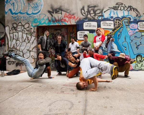
Way back in October, I had the opportunity to work with Flipside Studios and the crew of TvB (Traceur vs Bboys) and do a dynamic series of images in Graffiti Alley, Toronto. The concept was to figure out an interesting way to showcase the dynamic and talented crew of both groups of individuals.
Check out this awesome video courtesy of Deidre Casey & Joel Kesler summarizing the lighting setups of each shot:
Graffiti Alley is a public alleyway filled with graffiti in the heart of Toronto – this meant that having on location power was going to be somewhat of an issue and generators were not an option. Since I didn’t have my normal kit of White Lightnings + Vagabonds with me for the shoot, I approached Vistek.ca and asked them if they would be so kind to lend me some battery-equipped flashes to play with. They kindly agreed and I ended up strutting around the alleyways of Toronto with 2x Elinchrom Ranger RXs and 2x Ranger Quadras and a host of Rotalux lightmods.
Since the goal was to create shots that were dynamic with a large group of people in challenging positions, the safest way to approach the shoot was to shoot for the purpose of compositing. This would ensure that if ever I couldn’t manage to get everyone in the right position at the right time I could simply mask them right back into the images.
Communication at this stage is vital to not only understand what poses each participant is capable of doing, holding and repeating… but figuring out how they can all work together and fit into the composition.
More tips on communication and working with large groups of dancers in my previous blog post: https://blog.vonwong.com/how-to-bring-to-life-a-promotional-dance-campaign/
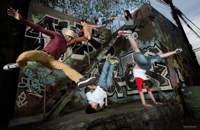
So what do I mean by “composition”?
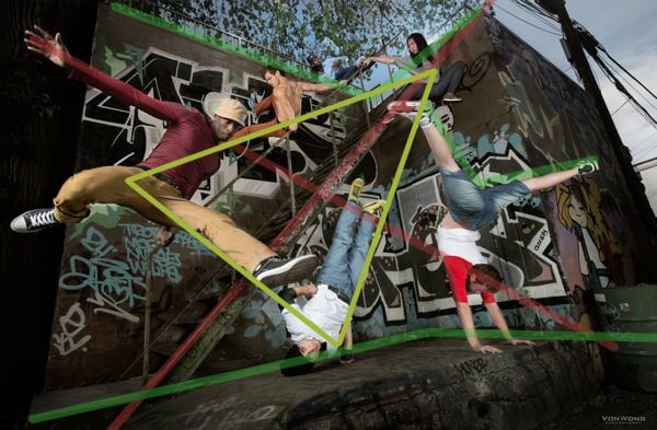
Well you’ll notice that to begin with, the lines of the buildings serve to accentuate the composition of the piece by drawing the attention of the viewer into the centre of the image. The edges of the buildings create “triangles” that point into the image.
Similarly, the lines created by the bodies of the characters in the image all relate to one another forming a compositional triangle that makes up the core of the image.
I’ve never officially studied photography, but I’ve discovered with time and a bit of experience that looking out for triangles & lines in an image has a massive effect on the image. Somehow, unconsciously the mind will recognize the shapes in the image and decide whether or not the image is interesting. A small tip if you’re trying to find these lines, is to imagine an “arrow” somehow pointing inwards towards the image.
Let us check out the second image of the series:
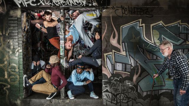
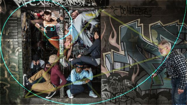
We created this humorous shot by inviting a passing tourist to come and participate in our photograph. Why? Because without him the entire image would make a lot less sense from both a storytelling and a compositional standpoint.
Way back in 2009, I was introduced to the Golden Spiral by photographer Jake Garn. At the time it blew my mind and since then I’ve always tried to apply this rule when taking my photographs. Curious to see how your images work with the golden ratio?
Head over to Adobe Lightroom – Launch the crop tool and press “o” (that’s the letter O not the number 0) until it cycles to the golden spiral. Wonder how to invert or move the spiral around? Shift + O is the magic button!
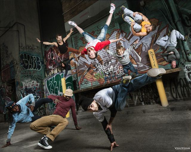
And for the 3rd and final image in the series we have a series of airborne and landborne characters. All airborne characters in this image were all composited back into the image which meant that there was a lot of flexibility when putting the final image together.
So how does one decide where to place characters when you have the freedom of putting anybody anywhere?
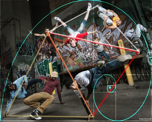
Well in this case it would be to blend both the compositional triangles as well as the golden spiral. In this instance, my Golden Spiral served as a reference for the extremities of the characters while the triangles created in the image served as reference guides.
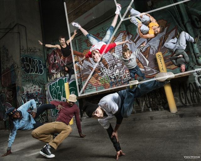
Additionally, the lines created by the buildings due to perspective also help create and generate focus… in this instance it acts almost as a massive arrow pointing towards the foreground elements of the image.
In conclusion:
I think most people are quite skeptical on how it’s possible to see all the varieties of shapes and lines while composing and creating an image. I know because I was certainly one of them! What you do notice with time though, is that if you do keep these rules in mind (just like the rules of third), you eventually do start seeing them without actually consciously looking for them. If these rules intrigue you I’d recommend you check out this awesome article here on Petapixel… and if that’s still not enough for you, head over to Amazon and grab this awesome book The Photographer’s Eye which breaks down all the rules of composition with pretty lines and examples.
Credits:
- Client: Flipside Studios, TvB
- Assistants : Julius Adarna, Basia Kowalska, Holly Thomas, Samantha Banks
- Video: Joel Kesler, Deidre Casey
Camera Gear:
- Sirui Tripod T2205X sponsored by LOVINPIX
- Nikon D800E: B&H | Amazon
- Nikkor 14-24 f2.8: B&H
- Nikkor 24-70 f2.8: B&H
Bag:
- ThinkTank Airport International V2.0 (best bag ever) B&H
Lighting Gear sponsored by VISTEK:
Announcements:
Full day conference coming up in Ann Arbor, Michigan, with Photo Studio Group
Photoshoot Sunday the 28th in Detroit in collaboration with Rob Woodcox to promote “Stories worth Telling”. Want to tag along? Leave a comment!

