A couple months ago, my good friend and data scientist Eric Berlow challenged me to explain the concept of “Climate Equity” through art.
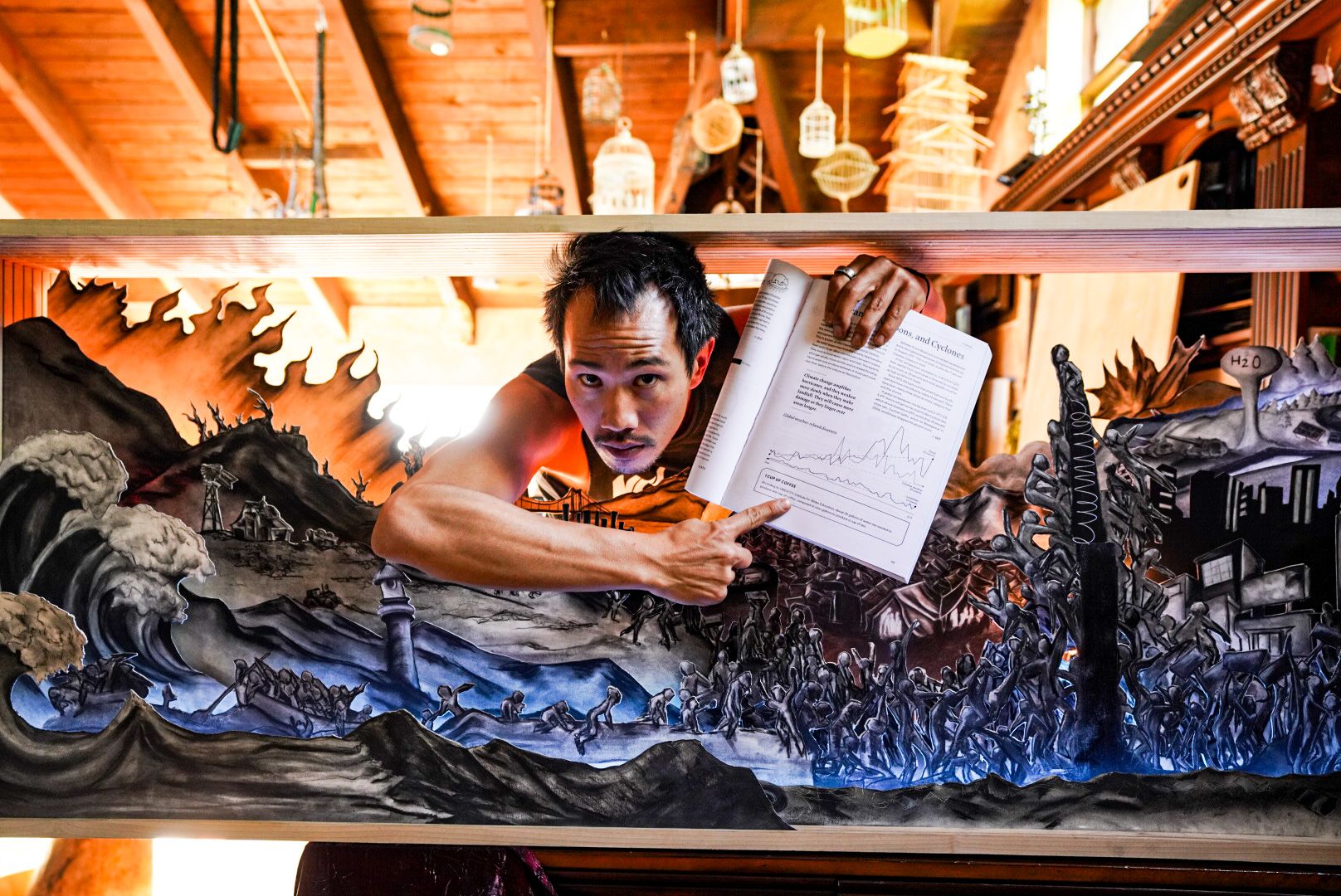
After throwing many different ideas around, we finally settled on making a diorama – a three-dimensional charcoal drawing made from 22 different pieces of paper, drawn with the help of 16-year-old illustrator Cadence Lark.
After hundreds of hours of planning, building, and filming – we came up with this short film that I think does the best job of explaining what climate equity is, why it’s important and what we’re doing wrong.
Script written with the help of Brenton Zola
Putting this together was like building your own puzzle
We started off with rough drafts on scrap paper to test out what the layout might look like and what size the entire piece should be.
All elements had to be carefully scaled in photoshop
With over 100 independent layers in photoshop, figuring out which elements belonged on which layer was a challenge. We drew out the layers digitally on an iPad before scaling them back into photoshop so that they could be traced out on a large television.
While Cadence focused on drawing, I focused on cutting.
From there, Cadence spent hours drawing the various elements out by hand while I focused on cutting everything out… without cutting off any parts.
Within a week, the entire space was a total mess.
What had started off as a beautifully clean and pristine loft soon became engulfed by scraps of paper and pieces of charcoal.
Meanwhile, Mike, Cadence’s dad, helped us build a box for the paper.
To ensure that the paper would stand upright, we had to dig groves into the sides of the wood with enough space to add some long LED strips. The total dimension ended up being 6 feet long and 2 feet high.
Then, it was time to put it all together.
To make the diorama feel three-dimensional, we had to place LED lights in between every layer. Different layers had different heights, so the LED lights had to be carefully placed in the right places too.
Finally, it was time to make the short film – which meant rebuilding the art installation over and over again to build the different scenes.
Diving into the art installation with graphs, like those found in the Carbon Almanac, was what made this project particularly visually interesting. It is the combination of art and data that makes for good storytelling.
Why go through all this effort?
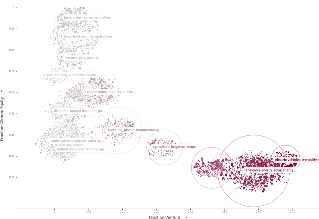
Well, here’s a vignette of some of the research that Eric‘s been working on that I used to make this piece. It’s super interesting, but it’s a little dry and requires a lot of words to explain. I think art helps to ease explanations like the one below, into something a little more digestible.
” In the graph below, each dot is a US-based company or organization that has received funding in the past 5 yrs and each bubble is a climate theme. The redder the category, the more they’re backed by Venture, while the greyer the category, the more they are Philanthropically funded.
Themes like Renewable Energy and Electric Vehicles receive over 78% of venture funding, while those that have a heavy focus on Equity are left to fend for themselves with philanthropic dollars. Right now, the private sector isn’t giving the billions of people on the bottom of the pyramid the opportunity to help us in the climate crisis.”

For those who want to watch a video instead that explains how all this came to life, check out this video here 👇
I spent over three weeks in the Elysian Sanctuary bringing this project to life. Special thanks to Jess for hosting us!


In Conclusion
The goal of this piece is to show how so much of the chaos being caused by climate change is preventable.
Within our deeply interconnected world, disruptions in one part of the world have rolling consequences – regardless of how wealthy we are. Only offering climate solutions to the wealthiest 1% not only isn’t fair, but it also isn’t going to work.
By enrolling and empowering the world’s most vulnerable to be more resilient against climate change, we can be more effective at fighting climate change together and preventing the worst from happening.
The first step in bringing about change is awareness – and I hope you can join me in sharing this project far and wide so that those in positions of power can start re-allocating capital more effectively.
Credits:
Creative Direction: Von Wong
Illustrations: Cadence Lark
Script: Eric Berlow + Brenton Zola
Data: Eric Berlow + David Banks
Location: Elysian Sanctuary
Media Center for Press and Licensing – Terms of Use
Feel free to share the photos and videos far and wide to help spread the word!
You can find digital use high-res photos here.
- Commercial, print, licensing, and installation requests: suzy@suzyjohnston.com
- Interview requests: ben@vonwong.com


